Thursday, November 13, 2014
New Dyslexic Font to help differentiate letters
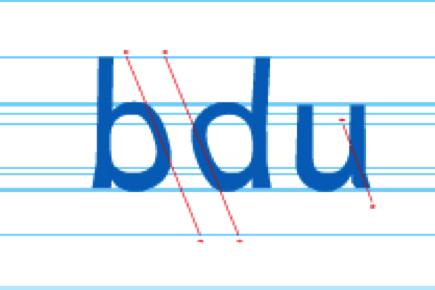
Christian Boer's font called Dyslexie has broken new ground in creating a Font aimed for Dyslexic thinkers. It makes the b and d slanted to help off-set reversals. It also gives distinction in certain letter's such as the u in the example above.
They also follow the same tactic as Virgin Mobility's Creator, who made another font for Dyslexic's, where the base of the letter is heavier or thicker giving it gravity for the reader.
I am so impressed with people that try and help Dyslexic's instead of pretending there is nothing wrong.
I encourage you to also print it using different colours as this might help the words themselves stand out for the reader.
Happy Learning!
READ MORE OF THIS AT https://ca.shine.yahoo.com/introducing-dyslexie--a-font-for-dyslexic-people-212550796.html
Subscribe to:
Post Comments (Atom)


No comments:
Post a Comment